CAL SCHENKEL
“I’m happy to take credit
for anything you want to
give me credit for”
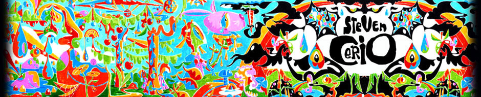
By Steven Cerio
CALVIN SCHENKEL is the uncrowned king of rendered absurdities. A painter, designer, and illustrator who was entrusted by Frank Zappa to design the lion’s share of album covers for his voluminous catalog as well as covers for various other groups, including Captain Beefheart, Cal came to embody the proto-Punk pseudo-Psychedelic point-of-scale propagandist. Album cover culture threw Cals’ work screaming onto the mindscreens of Sixties and Seventies youth at a time when the music was analog and the discs were big – real big – and an album cover sleeve was always there like a good friend (dog), its tender crease cradling your seeds oh so tenderly as you split up the contents of that alligator baggie…
Though born, bred, and raised in that drug-drenched era of anti-war slogans and brown Acid, Schenkel’s work had edge – an edge that graphics of the later Punk wave were seldom able to match. Schenkel’s influence still flows heavily through the work of Winston Smith and Gary Panter – two artists with a few notches of their own on the headboard of classic Rock imagery.
Whether riding the wave with Zappa or hiding out and painting in the Mojave with Beefheart, Schenkel always had the smarts – grabbing onto the reigns of his id and crashing it directly onto the paper, canvas, or film with a style that is at one moment silly, the next moment elegant. At some point his work echoes the throes of a crumbling machine gone berserk, spewing out Surrealist visual non sequiturs and Dadaist absurdities held together by only the thin threads and mucilage paper glue offered by its feeble and faltering composition – an illusion; similar to that created in much of Zappa’s musical work. It’s an amusement turned sarcastic; an intentional retardation of logic, and it comes from a mindset straight out of the manifestos of Surrealism. While some of Schenkel’s works delight while they destroy, some of his other stuff presents a snideness with the over-sweetening of sustained beauty and harmony of composition.
In the nineties Schenkel is still keeping his distance from the spotless skivvied Art Forum boys and their wine-sipping fans. Schenkel carves himself a deeper niche – one filled with history, creation, and freedom. And with Rykodisc’s newly-renovated and repackaged release of the Zappa catalog, Cal’s work is once again gleaming from the “record store” shelves like moistened gum drops and broken glass.
SECONDS: I guess you’re known first and foremost for your Frank Zappa covers. How do you feel about being so closely associated with him?
SCHENKEL: I have a lot of respect for his work, so I feel that it’s definitely an advantage. I think the disadvantage is that it’s always a subsidiary thing to be known in relation to someone else – especially with Frank, who was notoriously stingy for giving credit. Right now, it’s certainly an advantage because it’s going to help me to use that history to show my other work.
SECONDS: How much was Frank involved in the concepts for the covers?
SCHENKEL: It varied a great deal from the process of actually just illustrating his concept… For instance, One Size Fits All was basically an illustration based on a story, with some input from Frank as to what he wanted to see in it. Then there’s interplay, too, where I would have ideas beyond that preliminary state. On One Size Fits All, the back is pretty much my concept.
SECONDS: Was he much of an art fan?
SCHENKEL: Yes and no. I don’t think he was really studied in art or followed art trends, but he was certainly aware of basic art movements. Back to how we worked … One Size Fits All and The Grand Wazoo were obviously based on existing stories, but then a piece like Uncle Meat was entirely my design and I showed him what I did and he like it. It ran the gamut from a great deal of control with a pre existing concept to no idea to start with and me coming up with something and showing it to him.
SECONDS: Did your stuff fit Frank’s image or did you help define his image?
SCHENKEL: That would be really hard for me to say. I think that would be for someone else to say because I would have to be immodest. I think that, sure, there was definitely interplay, you know?
SECONDS: You guys were sharing an apartment right?
SCHENKEL: First of all, I lived with him for a very brief period. When I first met him in New York, the art studio was in his apartment – but that was only for a brief period. I didn’t actually live there, but I would commute to work at his place. When we moved to LA when he had rented the log cabin, I had a wing of it. It was my living quarters and art studio, which I rented separately from him. There was probably more of a chance to fraternize when I lived in that close proximity than when I didn’t, but even when I lived in my own place I’d be hanging out a lot and listening to what he was doing with the music. I think that it was just that I happened to fit the mold. I’m not sure I totally did understand it, but it just happened to coincide with what I was doing. I liked working in a lot of different directions and doing very eclectic stuff and working in different styles and Frank was doing that with his music. That’s one reason why it did work. In fact, many times in later years, there was very little relationship because Frank was much more isolated in his studio, working. I’d be dealing a lot more with his wife Gail or secretary. There wasn’t as much communication
SECONDS: How about Zappa’s ethos of ugliness – ugly Americana? Did you ever feel that would saddle your work with a tag you might not be able to transcend? Did you ever want beauty in there?
SCHENKEL: I don’t remember that being a problem particularly, because I could see the beauty in ugliness, too. I think that’s part of my art statement, too. There’s aesthetic beauty in a lot of things that normally may not be considered beautiful.
SECONDS: If you look at your covers for Burnt Weenie Sandwich or Uncle Meat, there was no other covers at the time quite like that –
SCHENKEL: Actually, Burnt Weenie Sandwich was done much earlier for another project when were still in New York, which was around the time of Lumpy Gravy and We’re Only In It For The Money. It was done for a project that Frank got involved in with Alan Douglas. We were going to be supplying advertising and packaging for a little label that Alan Douglas was starting, Moop. There were some ads done – crazy comic strip stuff, very surrealistic. Then I did a series of covers – I don’t remember what most of them were – but Burnt Weenie Sandwich was originally done for an Eric Dolphy album. Then at the last minute Alan Douglas backed out. That piece of art sat around for a couple of years and then Frank decided to use it. At the time he decided to use it, we had a minor falling out. I was out of the picture and he had this nice piece of art and decided to use it for Burnt Weenie Sandwich.
SECONDS: Back then, particular Rock bands and particular artists became known together – you and Frank, Roger Dean and Yes, Hipgnosis and Pink Floyd …
SCHENKEL: It would be really hard for me to critique that because I’m not familiar with as much stuff now as I was. Everything is so diversified now that there’s so many different directions and there’s also so many different ways stuff is going out. One thing in hindsight is when you look back at stuff, you see more of what’s classic and less of what’s mediocre. I think there’s always good around. I see a lot of good graphic art and I see a lot of mediocre art, too. As far as that specific connection between artists and groups, I don’t know of it myself. I don’t know that it was a real major thing. If you try and look for examples, you’re not going to find a lot of them.
SECONDS: Frank’s early work has that intense Psychedelic thing happening but he’s always been such a militant anti-drug guy. Was he making a statement about the Psychedelic thing?
SCHENKEL: Definitely. I didn’t use drugs either. I experimented with them a little bit when I was younger but I was never involved in the drug scene, which is one of the reasons that I did like working with Frank. I found it to be a problem with other people I might have started working with … it was a big problem to deal with the drug scene.
SECONDS: It seems most people think that when Zappa says “We never did drugs,” it’s bullshit.
SCHENKEL: He was an artistic genius and I also think he was able to see what was going on in society.
SECONDS: Whether or not you and Zappa did drugs you were still part of that culture by default. Frank and yourself are very much the exceptions – most Rock music comes out of a subversive and problematic origin. You have the look and feel of the lifestyle even though you don’t live it. How do you feel about that? Are you opposed to drug use?
SCHENKEL: On a personal level, it doesn’t agree with me. I think that’s primarily metabolic. I experimented a little bit with drugs when I was younger so I’m familiar with the experience. I found that a lot of people I know that use drugs for the insight it gives them, have gained insight. I think drugs can be used to gain insight – depending on the drug and user – and I’m not against that insight, but I think that insight doesn’t only have to come from drug use. The insight is coming from the individual; the drug is only a mechanism.
SECONDS: Do Zappa fans make up a big part of your fanbase?
SCHENKEL: Definitely. Over the years, I’ve been able to cultivate it myself. I’ve done some mail-order catalog merchandising and I hope to do a lot more of it in the future. I’m working on some projects now and I really want to work with Ryko to do something. I’m not particularly aggressive, and I haven’t been in the past – like going to galleries and looking for outlets for my work. I’m kind of a hermit, you know? Once you get to communicating with certain fans, it just kind of grows. I’ve built a pretty big base of people that I deal with.
SECONDS: Do you have reservations when it comes to promoting your work?
SCHENKEL: It’s very hard for most artists to market themselves. Some may be better than others. I’m probably in the group that’s the worst at it. Being a very introverted type of person, I find it so much easier to deal directly with people because I’m talking to somebody who knows my work and likes my work. There’s a common base for communication. If I go out to a gallery – it’s changed a lot because the people involved in that echelon of art marketing are more aware of my work. But back when I started doing it, it was just an enormous obstacle. I spent a lot of time looking for work. A lot of people were aware of my work but it just wasn’t ready for the market at that time.
SECONDS: It seems like your style started the whole Punk graphics thing.
SCHENKEL: I’d love to see that mentioned in some history. I’m happy to take credit for anything you want give me credit for. It’s hard to give yourself credit; it’s hard for an artist to market themselves. I think probably the most successful artists are able to do that, or have someone close to them do that for them – that’s another thing that’s been difficult, because I’m pretty isolated. I haven’t found someone to work with me to do that. I’ve also been on the outside, even when I was in LA, which is the middle of the market. Where I am now, there’s no market at all. If people find out about me, great, but I rarely go out looking for work. I probably will now that there’s this big thrust of material that’s suddenly out there. I definitely will take advantage of it, but I’ll do it in a way that will be very impersonal. I’ll just send out promotional material, a mini-portfolio …I really hate calling people and looking for work.
SECONDS: You’ve always straddled the fence between illustration and design.
SCHENKEL: After thinking about it for years and years, I’ve always come up with the conclusion that I’m really not in any camp. I’m just an artist. That’s one of the great things about working for Frank, that there was always something new I could experiment with and there was always a lot of different realms I could deal with. That’s what I enjoy most about art. I never could find a niche that was just the thing I was going to concentrate on. A lot of it was practical in the beginning when Frank had the need for a lot of different things. I got into advertising, working with type and working with all the elements of a project because it all needed to be done. Then I got into doing animation and even set design because it needed to be done. I enjoyed stretching in all those different directions. For me, that’s what I really like about it. I don’t consider myself a designer or an illustrator because I’m not good enough. I just don’t have what most illustrators have, and that’s the honed, polished, single-minded look. Some illustrators have a specific look and that’s it. A lot of that’s practical, too, because that’s the easiest way to sell your work. I could never fit into any mold – I’m too crazy.
SECONDS: Do you think that’s related to the way you are personally?
SCHENKEL: Probably is. I just have a very weird metabolism. I get real slow spots and real high spots with energy. The only way I can really get a job done is to work all night on it. The hardest part for me is getting started. Once I’m into it, I can’t quit. There are times I’m working on a project that’s so intense that you have to work all time on it, whenever you can …I have a tendency to spend more time on the beginning phases of a project and then have to rush to finish it. Once I’ve designed the whole thing, finishing it is relatively easy.
SECONDS: When you were developing your style, who influenced you?
SCHENKEL: It’s a hard question to answer because I’ve been influenced by so many people and different things. From the standpoint of the work I’m known for, it would be the Surrealists and Duchamp. If I’m working on a specific project and I have a particular style in mind that I want to work in, I will allow myself to be influenced by certain artists, particularly older master artists …I love looking at all schools or art.
SECONDS: Would you have liked to been around for Dadaism?
SCHENKEL: Actually, I think that now is always the best time to be around. Being around now allows you to really appreciate that period. If you were around then, you wouldn’t be appreciating now.
SECONDS: You’ve now repackaged the part of the Zappa catalog your originally worked on.
SCHENKEL: That only amounted to about a third of the full catalog.
SECONDS: It’s still a giant amount of records, though…
SCHENKEL: I should sit down and count them out. There’s probably no more than twelve.
SECONDS: Of all the record covers you did not do for him, which one was your favorite?
SCHENKEL: I’m not going to give you one answer to this because I like all of them – well, a lot of them. I really like David McMacken’s work – Overnite Sensation, 200 Motels …He has a fantastically sophisticated, polished style. I really like Neon Park’s work a lot although the cover of Weasles Ripped My Flesh is not my favorite Neon Park work. Wait, let me not forget Gary Panter because I love his work too. I think the covers he did for the Zappa stuff for Warner Bros. without Frank’s involvement don’t represent his – I don’t want to say anything negative here but I think I like his other work more too. I think that they’re not as complex as some of the other stuff.
SECONDS: How is musical composing similar to visual design? Did you learn anything from working with musicians that helped you to expedite the production of your own work?
SCHENKEL: I don’t think I would say so, although I probably did. Some of the work I do is more of a …almost a dance. Some graphics, where I’ll be working with technology – it’s like playing an instrument in a sense, too. I see it less with illustration and traditional media.
SECONDS: Do you do any painting?
SCHENKEL: I’m doing some large stuff, working on panels and on unstretched canvas. It’s starting to really turn into what I want. It’s hard to explain what it’s about. In terms of the working process, I’m working primarily in acrylic, but I use a lot of mixed media and sometimes I incorporate found objects. A lot of it is kind of Abstract but it does have Surrealistic tendencies. I just like painting – it’s so much fun and fulfilling. Then I’m also doing more fan-oriented stuff where I’ll do a pastiche of an illustration from elements from the Zappa covers. I’m doing some limited-edition prints in different prices and sizes – some silkscreen, some multi-color litho. I’m also doing what I call album reconstructions where I take an album cover – which I have to get from collectors now – like Uncle Meat and I’ll open it up to a four panel spread and then I’ll work on top of it using found art and painting all types of gooey materials. To do a piece like that is a little more affordable than starting from scratch and it also has that relationship to the old work. I’ve done quite a few of them over the years and I’ve got them to a point where they’re a little more formalized. Another thing I’m doing is selling t-shirts and cards and I hope to have a catalog of that before the summer’s done. One thing I want to do with this catalog is a newsletter which will have some background and stories. I’ve come up with some of the history of these covers and I want to write that down. I want it to be a real free-form crazy thing.
I used silkscreen, print and splatter whatever else onto this huge sheet of board and then chop it all up into little pieces. I found each one is this unique little piece of art and I didn’t want to sell them. It’s a real cheap way to create something and sell it for an affordable price. I found that when I do the mail-order thing, it is nice to have affordable stuff because a lot of the fans don’t have a lot of money to spend. It makes it worthwhile to sell a hundred t-shirts when I do a catalog mailing.
SECONDS: What kind of designs are you going to be doing for those?
SCHENKEL: I’d silk-screen all different stuff and then I would wind up with a whole bunch of samples that I wanted to keep for the next batch so I wouldn’t forget what I did. Then I decided I needed to formalize it. Now, every time I do one I’ll print the same shirt in an edition. They’re pretty cool. The next time I do it, I’ll do a different edition with different images but it’s the same idea. I always have my Rraallff shirt, which is that dog guy and also my E-mail address on America Online. It’s just a giant blowup of this little drawing and I have that on the front of some of them. I always have some odd ones. Sometimes I do a t-shirt of the month when I’m really cookin’.
SECONDS: Who are your favorite contemporary artists?
SCHENKEL: In the Fine Art realm, one artist I’ve been looking at is Sigmar Polke. He mixes Pop with Post-Modern ideas. We mentioned Gary Panter – I really like his stuff. I like a lot of artists that I don’t even know their names. I love Captain Beefheart’s stuff, I always have, and he’s finally getting some recognition.
SECONDS: Didn’t you hang out in the desert with Beefheart? Anything strange happen?
SCHENKEL: It’s really hard to remember all the details … we hung out a lot and painted. We’d go on little trips. One time I went out to take some photos of him.
SECONDS: For the Trout Mask Replica cover?
SCHENKEL: No, that was much earlier than when I was hanging out with him. There were a couple of brief, intense periods relating to Beefheart – or, to call him by his proper name, Don Van Vliet. At other times, Don and Frank weren’t getting along, so he wasn’t around or I wasn’t around. There were just a couple of brief periods and one of them was when we did Trout Mask. I don’t remember whose idea it was to do what we did but I would say it was a collaborative thing. The way it came about, I went and found this carp head at some fish market. We took it back to my studio, which was the same place that I did the Uncle Meat cover – another very interesting thing that happened there was the cover for the Wild Man Fischer album – and I took the trout head and hollowed it out – the thing stank like hell – and Don had to hold it up to his face for a couple of hours while we shot.
SECONDS: Was he complaining?
SCHENKEL: Not really, he was really good-natured about it all. I have this incredible piece of 8mm film of him playing the baritone sax through the trout head. It was like an actual animated version of that cover. That was when I first met and we had a lot of interesting conversations about art, philosophy and reality. He would come by when I was working on the cover and we would hang out and talk. We got into some interesting conversations. The whole band was living in Woodland Hills when they were working on that album. I went out there to do photos, but then I didn’t see much of him until around the time of Bongo Fury, a good four or five years later, when he got involved with Frank again. At that point, he was living in this little trailer in Lancaster, where he grew up. I would go out there and we’d paint all night. It was right across the street from the desert and we’d just walk out into the desert and watch crows. Don was into nature, as I am too. Since I didn’t use drugs, it was the equivalent of tripping in nature. Don is a very unique person – I don’t want to say “peculiar.”
SECONDS: Tell me the other covers you did for other bands.
SCHENKEL: I did Trout Mask Replica for Captain Beefheart, I did the first three Tom Waits covers, I did a lot of stuff I wouldn’t want to mention – a lot of groups that just disappeared.
SECONDS: Tell me one of them.
SCHENKEL: I can’t think of one I want to mention. More recently, I’ve done stuff for obscure groups that no one would ever have seen.
SECONDS: How should Frank Zappa be remembered?
SCHENKEL: If I were to sum up his meaning to music and art in this century, it’s as someone who opened new doors by experimenting with so many different things, expanded the envelope, and brought other types of music into Rock.
SECONDS: And how should we remember you?
SCHENKEL: To some extent, in the same way – for connecting diverse parts of art. I think one of the things that I feel that I did was bring different types of art into that commercial records package. But I haven’t begun, so there’s nothing to remember me by yet.